A New Discovery! Visualizing a Wireless Network
Share
Warning: this is pretty geeky.
I don’t claim to be a Wi-Fi expert, but I have to say that after hanging out in the Wi-Fi world for the last year and half, I’ve definitely picked up some knowledge. Which is great, I love learning new things – especially geeky type things. And because I work a lot with iBwave Wi-Fi and go to the Wi-Fi shows, I tend to think about Wi-Fi these days way more than….I ever thought I would.
So anyways, a few weeks ago while I was thinking about Wi-Fi I thought to myself ‘I wonder what Wi-Fi sounds like, what does it look like?’ Because I’ve always been interested in the idea of visualizing data. I often think about things like ‘what would the book I’m reading look like if I were to take all the text in it and then plot it on a heat map to see what words are used where. Or, I wonder what this song I’m listening looks like. Or, I wonder what my daily routine looks like mapped out over the course of a year. Yes, this really happens. Which brought me to that thought I originally had a few weeks ago about visualizing – and audiofying (new word) Wi-Fi. I had no idea, but it intrigued me.
And at the time I kind of dropped the idea, but this week when I was wondering what to blog about, the thought crossed my mind again and I started to wonder if there was a way I could visually plot data flying through my Wi-Fi network. I have WireShark packet analyzer, so I have a way to collect data – I just need a way to plot it somehow.
Enter everyone’s best friend, Google.
And oh what I discovered. Now maybe I’m just out of touch, but I discovered this open source program called Processing (do any of you know about it?). Apparently fairly well known but not to me.
So, what exactly is Processing?
Processing is essentially a program that allows you to take any type of data (really, any type) and then present it visually, in many different ways. Now, it does require some programming knowledge, but it’s really not so bad – fairly simple in terms of programming I think. And luckily for me I was a Visual Basic ninja many years ago (oh the Macros I wrote back then!) and that combined with my little java knowledge, I have managed pretty well to get a decent grasp of how to work with the program. Especially since there are many examples out there to help (and inspire).
Okay okay, so what did I do with it?
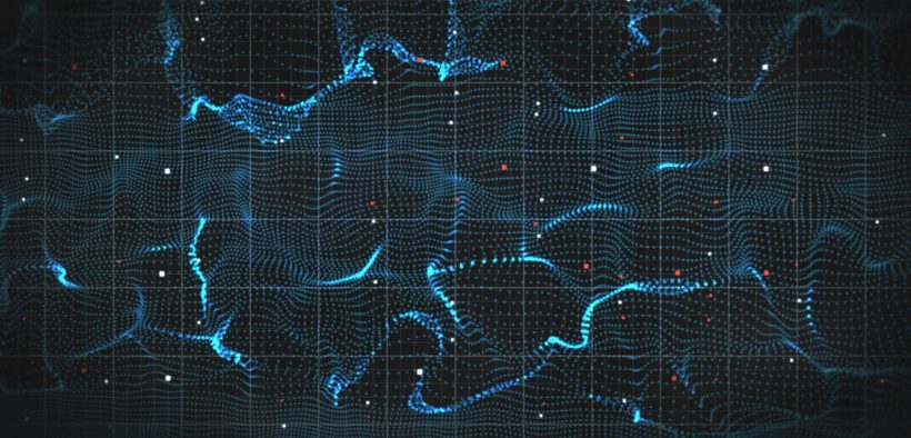
The answer is – not nearly as much as I WILL one day, but I like what I was able to figure out and create in the little time I’ve had with it. Essentially what you are looking at below is mapping all of the IP addresses around me on the network and lines which connect them.
How did I do that?
Essentially there is a library that comes with processing that allows you to gather the IP addresses on the Wi-Fi network you’re connected to. Then I essentially looped through those addresses, saved the X and Y coordinates into array, plotted the dots, plotted the line to connect it to the previous point, and voila, the visualization comes to life. The coordinates of the IP address are equal to the third and fourth parts of the IP address. How did I get the coordinates? Using an example from the web, I used the parts of an IP address. So for example if the program is mapping is 192.168.2.56 then it’s using 2 as the x coordinate and 56 as the y coordinate and plotting a point there. Then it plots the next IP address and connects it. That is what I tried to do anyways – I kind of just stopped when I thought ‘hey, that looks cool’, and then decided to write a blog about it in case anyone else might find this interesting other than myself. The great thing with this program as well is that there are many libraries out there to help you, and once you are done, you can easily package your program into a clickable app that you can run from anywhere. Neat, right?
Anyways, my geeky self is having a lot of fun with it and am very thankful for the examples that helped me get started and bring this first little visualization of mine to life. So, while no means am I an expert at this point – I hope to be one day.
Stay tuned for more of my visualizations in the future (any requests?) – and in the meantime check out a couple of these beautiful network visualizations I came across that also use processing (and you will see why I showed mine first….)
Wirelessly yours,
Kelly
- Cleared for Takeoff: Private Networks in Aviation - January 21, 2025
- A Tour of iBwave Viewer - November 23, 2020
- Introducing Augmented Reality in iBwave Wi-Fi Mobile - September 10, 2020


